January Monthly Predictions
What to Expect
With the first trading day of January starting tomorrow, let us take a look at how the month is setting up.
As we will always do, the first thing to be reviewed will be the Candlestick portion of the Monthly chart. We will look at how the 3 white horizontal Support and Resistance Lines were established and the best way to utilize these prices as the month progresses.
From there, we will look at the additional indicators below the chart to see what the momentum looks like with the MACD and RSI line graphs.
There will be only minimal mention of the Moving Averages; however, those will come into discussion more during the Daily Chart breakdowns.

Top Half Analysis
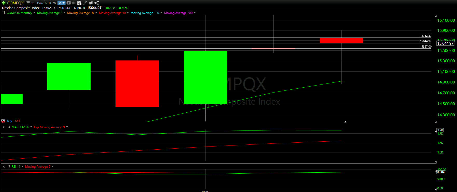
Though the NASDAQ was trading near all time highs in December, the red candle does allow us to establish historical Support and Resistance lines (as opposed to the Dow Jones and S&P 500 Monthly Predictions that required imaginary Resistance lines to be created).
Because the December candle body is somewhat small, only 2 lines were created at the top and bottom at $15,752.27 and $15,644.97 respectfully. Additionally, the third support line is essentially most of the November candle, landing at $15,537.00
The only Moving Average in site during this 6 month view is the green 8 Moving Average line. It seems the NASDAQ actually dropped just below the 8 Moving Average during the month of December, then bounced up to all time highs before a slight drop
Overall, the Top Half technical analysis of the NASDAQ chart has been positive, though not as positive as the Dow Jones and S&P 500 charts. All three of the majors have a similar correlation, which is always positive. However, the Nasdaq is clearly sluggish between the three

Bottom Half Analysis
Starting with the MACD, it is comforting to see the Green line so far above the Red line.
It does seem; however, that the peak of the green line may be starting to bend in a downward direction. It is very hard to tell at this point; however, at least it does not look like the Red line is in a sharp incline up either.
Once again it seems the Dow Jones and S&P 500 charts had a better separation between the red and green MACD lines.
Keeping the positivity, it seems the RSI is also fairly positive.
It is comforting to see the Green line over the Red line, and it seems there is some separation starting. It should be noted that the RSI is a little too high for comfort - sitting at 84.89. Generally, anything over 80 is considered overbought and a desire to cool off would be expected.

Final Thoughts and Targets
Overall, there was a lot of positive in this monthly chart for the NASDAQ Index.
All three of the majors have a similar correlation, which is always positive. However, the Nasdaq is clearly sluggish between the three
Final price range of $15,800.00 - $15,720.00 would be ideal and set up February to keep the run going.