January 3rd Recap and 4th Predictions
What to Expect
With the first trading day of January completed, let us see how the day played out and what to expect tomorrow.
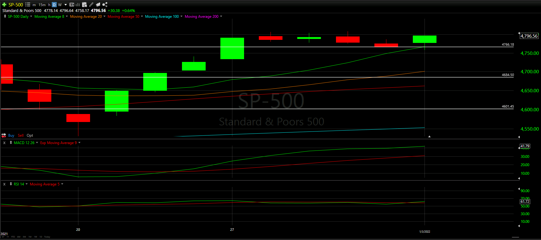
As we will always do, the first thing to be reviewed will be Top Half of the Daily chart. We will see how the horizontal Support and Resistance Lines from our January Monthly Prediction played out during the first day, as well as review the Moving Averages that came into play.
From there, we will look at the Bottom Half of the Daily chart to see what the momentum looks like going into tomorrow with the additional MACD and RSI indicators.
Overall, what we expected seemed to have played out as we will see below:

Top Half Analysis
With the last two trading days of 2021 being negative - as you can see from the 2 red candles before today - there was a lot of fear coming into the morning. However, based on our January Monthly Prediction, we at least had more optimism than most.
Aside from a little fear that we will see in the Hourly Analysis below, the S&P-500 crushed it today! The day opened well above the entire red candle from Friday 12/31/21 and continued to rip upward the entire day.
As a result, we needed to establish 2 new support lines - both in Yellow above - to help gauge how the next days may progress. These 2 Yellow lines are pretty close to each other, so there is a good chance one will get adjusted as we gain more information in the coming days.
Overall, the Top Half technical analysis of the S&P-500 has been positive. Let us see if this carries over to the Bottom Half technical analysis as we look at the momentum indicators.
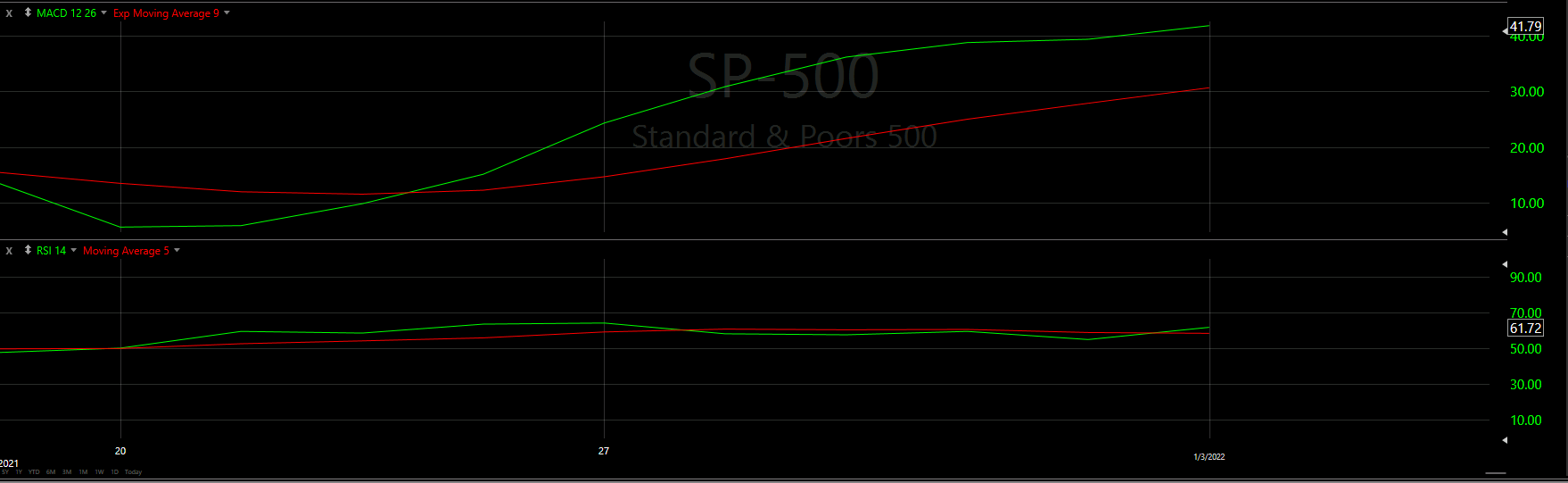
Bottom Half Analysis
Starting with the MACD, it is comforting to see the Green line so far above the Red line; the same trend we saw during the January Monthly Prediction
What is even better is that the peak of the green line may be starting to bend in an upward direction. It would be ideal to see more of a decline in the red line; however, the green line going up and the red line staying steady is positive indeed.
Keeping the positivity, it seems the RSI is actually doing the same thing as the MACD. There is a clear upward bend in the green line and red line seems to be staying flat or even declining a bit. None the less, when both momentum indicators are showing the same trend, there is nothing but positivity to be felt.
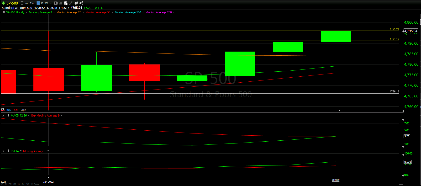
Hourly Analysis
The S&P-500 had a similar Hourly Analysis to the NASDAQ chart.
The hour started negative, based on the red colored candle, and the top and bottom wicks were both pretty extreme in length. However, with the help of the support line and the 50 Moving Average, the S&P was able to rebound and bounce up through the day.
The final hour seemed to have a bit of a scare, based on the long wick at the bottom that nearly touched the 20 Moving Average. However, those who stayed were able to see the final hour close positive.

Final Thoughts and Targets
Overall, there was a lot of positive in the daily and hourly charts for the S&P-500
Based on the positivity from the Top and Bottom Half Analyses, we should continue to see an uptrend tomorrow.
Ideally we finish above both our new Yellow Support line or at least above half of today’s candle; as illustrated in the white box above
Good luck trading!