May 9th Recap as well as May 10th Predictions
What to Expect in Today’s S&P-500 Analysis

With the sixth trading day of May completed, let us see how the day unfolded and what to expect tomorrow.
Above you will see the full view of the Daily chart; Top and Bottom indicators included.
As always, we will start by analyzing the Top Half of the Daily chart; seeing how our horizontal Support and Resistance Lines played out during the day, reviewing the Moving Averages that came into play as well as comparing previous candles.
From there, we will analyze the Bottom Half of the Daily chart to see what the momentum looks like going into tomorrow with the additional MACD and RSI indicators.
Ultimately, we will use the combined data to help predict the movement of the S&P-500 for tomorrow.
Top Half Analysis
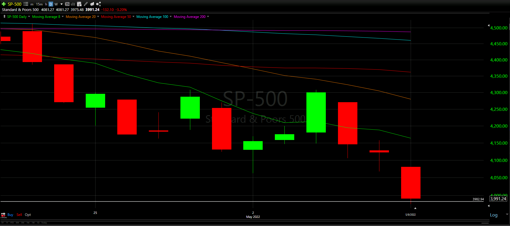
The S&P-500 finally made it to the first of the new support lines created at the start of the month.
With the NASDAQ and Dow both losing their respectful Support Line days ago, it seems this $3.9k line helped ease the fall.
Perhaps this helped the NASDAQ and Dow from dropping more than they did since neither had any Support lines.
However, just like the rest of the Majors, the S&P-500 lost all of the Moving Average lines and is trading well below the 8MA.
We may need to start zooming out more for tomorrow’s chart to really understand what the fall looks like.
Not Good, to say the least…
Bottom Half Analysis
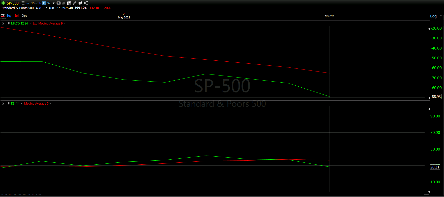
The goal of the Bottom Half analysis is to see a similar story between the MACD and RSI indicators. Ideally both are doing the thing, adding to the confidence of the readings.
Unfortunately, today, the MACD and RSI indicators are aligned… and it does not seem to be positive at all…
Starting with the MACD, clearly the green line is well below the red with a hard decline still seeming realistic. There is not even a slight hint at an upward curve on the green line.
The RSI seems to have officially lost the battle between green and red, with the green line starting to sharply diverge from the red line.
The combined indications of Red lines over Green lines across the MACD and RSI is horrible.
…these 3%+ losses are not finished yet.
Hourly Analysis
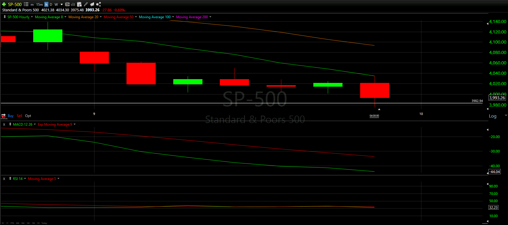
Mimicking the NASDAQ’s Hourly chart, the S&P-500 also had a horrible Hourly Chart compared to the Dow Jones.
The first hour started well below the entire green candle that closed Friday’s trading. Not only that, the gap between the start of the day and the 8 Moving Average line is huge! Making up this challenging start will be wildly difficult, and what should have been the first sign that the day was going to be rough.
Overall, each hour was basically a loss, with only 2 of the 7 posting a minimal green gain.
None of the hours really battled the 8MA, with the exception of the top wick on the last hour.
Tough day of trading, indeed!
Final Thoughts and Targets
Based on our Top and Bottom Half analysis, it seems very likely that the S&P-500 will also lose the first support line created earlier this month, mimicking the Dow Jones and NASDAQ.
Best case scenario would be the day is positive and is able to close at or above 50% of today’s candle.
All the Majors are trading well below the 8 Moving Average so that needs to change.
However, all signs really are pointing to more bad days.
Good luck trading!
Don’t forget to check out the Free Knowledge Center to refresh the basics or learn more about Technical or Fundamental Analysis