January 13th Recap and 14th Predictions
What to Expect in the Analysis Below
With the ninth trading day of January completed, let us see how the day played out and what to expect tomorrow.
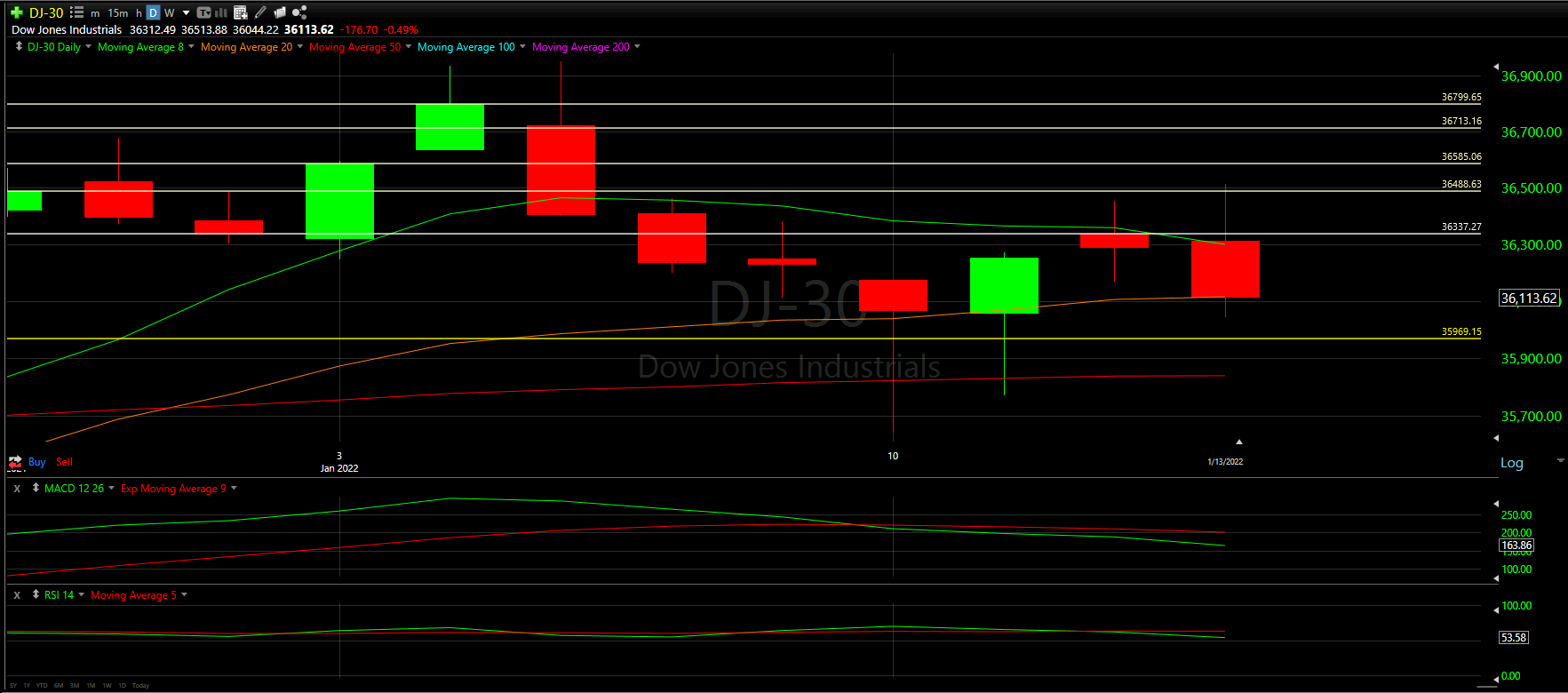
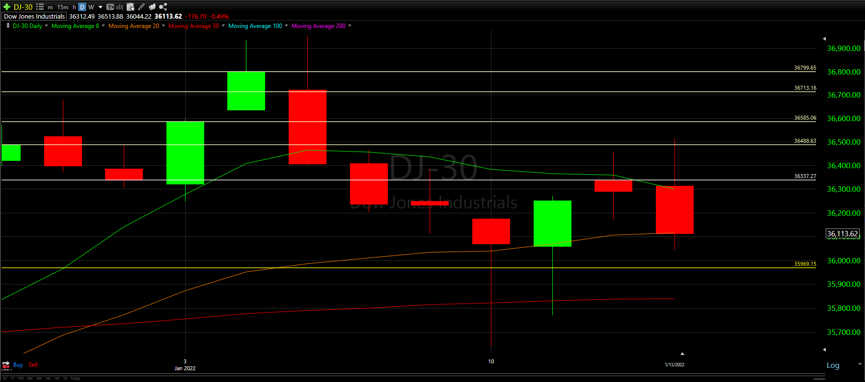
Above you will see the full view of the Daily chart, Top and Bottom Half indicators included.
As always, we will start by analyzing the Top Half of the Daily chart; seeing how our horizontal Support and Resistance Lines played out during the day, reviewing the Moving Averages that came into play as well as comparing previous candles.
From there, we will analyze the Bottom Half of the Daily chart to see what the momentum looks like going into tomorrow with the additional MACD and RSI indicators.
Ultimately, we will use the combined data to help predict the movement of the Dow Jones for tomorrow.
Top Half Analysis
Yesterday’s worse case prediction pretty much happened to a tee
The Dow Jones’ tough day ended up dropping the candle back down to the Orange 20 Moving Average line - it seems we closed almost exactly on the Orange line. More so, we ended up failing to overtake the 8 Moving Average line in green and continue to trade under that line for 6 days in a row. Ouch!
It seems the uncertainty of the dreidel-like candle was answered today and once again we see the Down dropping more - potentially all the way to the 50 Moving Average line in red towards the bottom of the chart above.
Bottom Half Analysis
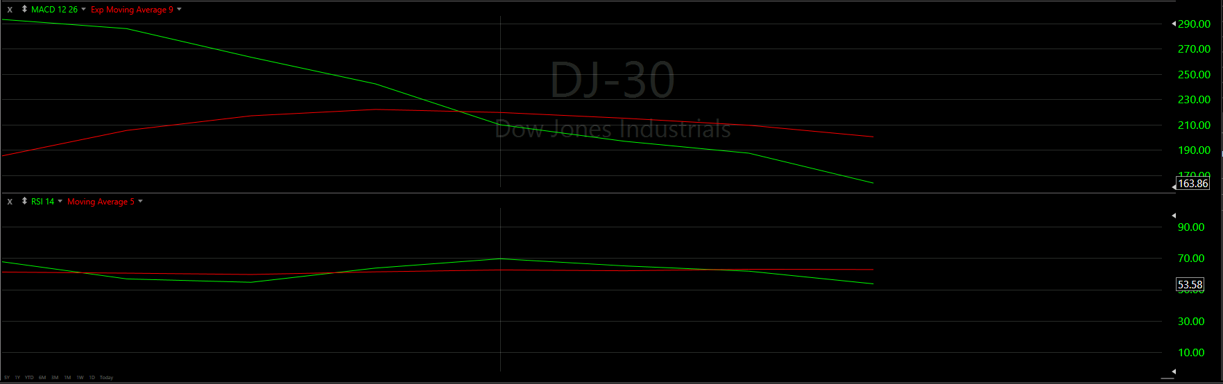
Well… after a few days of conflicting information with our momentum indicators, the MACD and RSI are finally aligning.
We now see that the Green line in the MACD took a sharp turn down, instead of up, dashing any hopes for a curl over the Red line. With a declining slope and increasing gap between the Green and Red lines, there is very little to interoperate here expect really bad momentum on the way.
Seems like the RSI was showing the real truth this whole time - the Green line continuing the downtrend and now the MACD follows.
This is why it is always important to look for aligned messages from your indicators. When something seems off, generally, it may be a foreshadowing sign.
Hourly Analysis

The hourly chart for the Dow Jones really made a 180 from the start to end of the day.
The Dow kicked off with a positive start for the first 3 hours.
We can see the first candle starts under the 8 Moving Average, but was able to shoot it’s way above the cluster of Moving Averages.
From there, it was an upward climb until we hit our horizontal Support line. Here it actually acted as a Resistance line, keeping the candles from continuing up. From there, there cluster of Moving Averages was lost and never recovered.
The last hour you can see puts us at quite a freefall as well…
Final Thoughts and Targets
With nothing but bad news on the Daily and Hourly charts of the Dow Jones, it seems we will be continuing this downtrend for at least a bit longer.
Our best hope would be that the yellow Support line catches this fall otherwise, we could be heading down even lower to the 50 Moving Average.
Either way, one of those really needs to help us bounce up! Until then, there is little to expect but more lows for the Dow Jones
Good luck trading!
Don’t forget to check out the Free Knowledge Center to refresh the basics or learn more about Technical or Fundamental Analysis