January 12th Recap and 13th Predictions
What to Expect in the Analysis Below
With the eight trading day of January completed, let us see how the day played out and what to expect tomorrow.
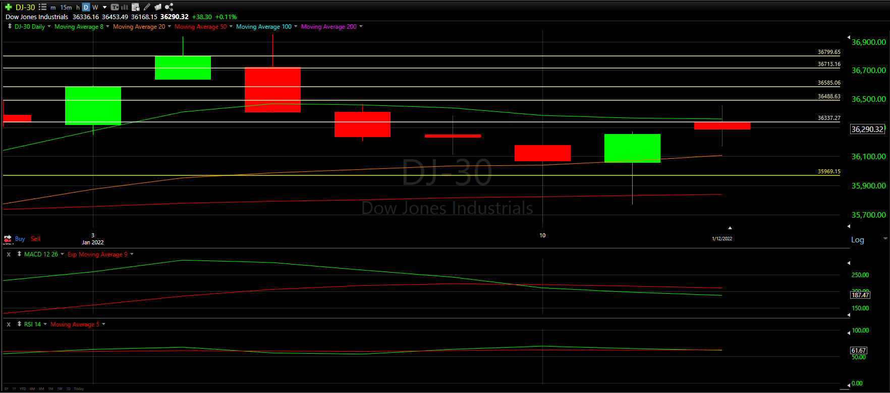
Above you will see the full view of the Daily chart, Top and Bottom Half indicators included.
As always, we will start by analyzing the Top Half of the Daily chart; seeing how our horizontal Support and Resistance Lines played out during the day, reviewing the Moving Averages that came into play as well as comparing previous candles.
From there, we will analyze the Bottom Half of the Daily chart to see what the momentum looks like going into tomorrow with the additional MACD and RSI indicators.
Ultimately, we will use the combined data to help predict the movement of the Dow Jones for tomorrow.
Top Half Analysis
Just as we saw in the NASDAQ and S&P-500 Daily Charts, there is a clear dreidel-looking candle, which is always a sign on uncertainty. The long wicks above and below the candle mean there were times the Dow Jones wanted to take off and other times where it wanted to drop.
From there it should be noted that we were stopped by our Support line - pretty much starting right on the line and going down from there. It is fair to say that this Support line stopped us from getting back above the 8 Moving Average line.
As good as it is to see the curve in the daily chart holding, there is a bit of worry here.
Bottom Half Analysis
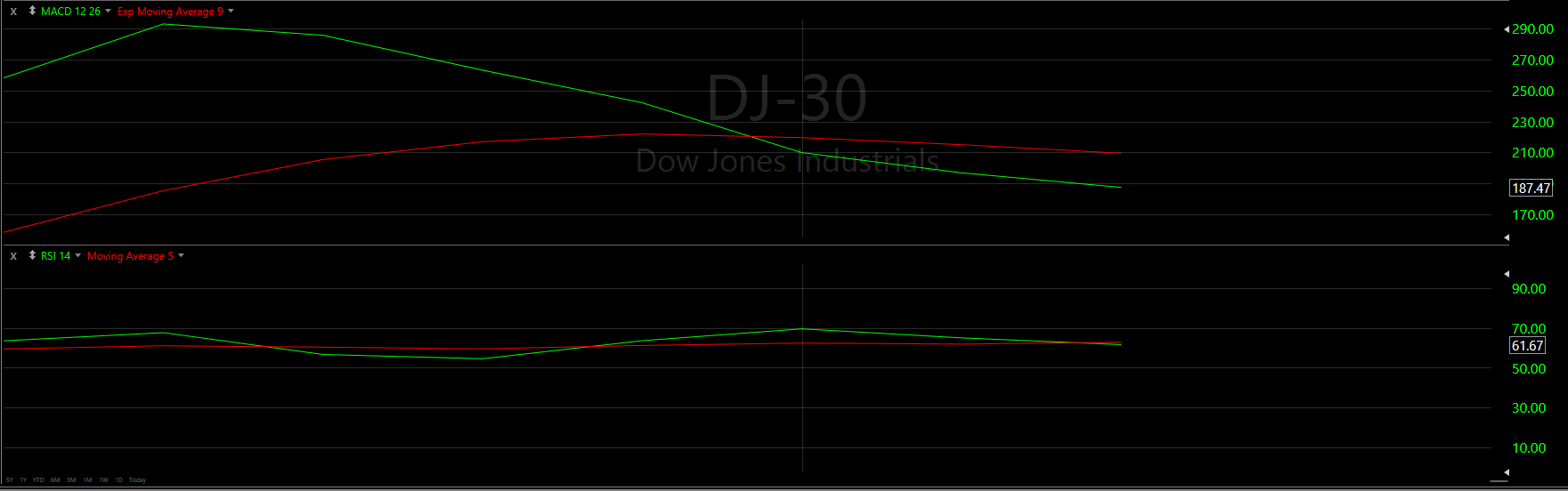
For a second day we continue to see the same discrepancy between the MACD and RSI lines.
The MACD still appears to show the Green line starting a curl up, with hopes of surpassing the Red line in the coming days. The Green line is somewhat flat instead of upward in slope, but at least we did not see a wild crash down.
The RSI; however, is trending down though the last days have been positive. We have echoed the potential worry this shows because it may be difficult to keep an upward trend with low momentum from the RSI.
None the less, let us hope the MACD is the indicator that matters more here for another day!
Hourly Analysis

Just as we saw with the S&P-500 and NASDAQ Hourly Charts, the Moving Average lines really did come into play here, combined with the Support line we established at the beginning of the month.
All 3 of the Major Markets started with a positive first hour and seemed to calm down from there.
Here we see the first hour start around our Support line and close above the 50 Moving Average line in red.
From there the next two hours work their way down passed the 100 Moving Average line. It seems; however, the next couple hours follow the 100 Moving Average line until ultimately losing that and the 8 Moving Average.
Final Thoughts and Targets

Unfortunately, we did not really get the confirmation today that we were hoping for. There were a mixed bag of positive and negative in this analysis so we are keeping expectations moderate to low for tomorrow.
Best case scenario, we actually close above the 8 Moving Average and start to climb back up those horizontal Support Lines
Worst case scenario, we lose this momentum and drop back down to the 20 Moving Average line
Good luck trading!
Don’t forget to check out the Free Knowledge Center to refresh the basics or learn more about Technical or Fundamental Analysis