January 5th Recap and 6th Predictions

What to Expect
With the third trading day of January completed, let us see how the day played out and what to expect tomorrow.
As we will always do, the first thing to be reviewed will be Top Half of the Daily chart. We will see how the horizontal Support and Resistance Lines from our January Monthly Prediction played out during the first day, as well as review the Moving Averages that came into play.
From there, we will look at the Bottom Half of the Daily chart to see what the momentum looks like going into tomorrow with the additional MACD and RSI indicators.
Overall, what we expected seemed to have played out, just worse than expected:

Top Half Analysis
Our caution coming into the day was confirmed with an extreme red candle when compared to the last few. Yesterday, we discussed how the 1/4/22 candle showed a lot of uncertainty in the market and today, well, it was clear that downtrend was the direction. Keep the dreidel-looking candle in the back pocket for next time. When there are large even-sized wicks on top and bottom of a candle, that will mean a sign of uncertainty with the next day or two confirming (in general).
Continuing the analysis, we can see that today’s candle closed well under the 8 Moving Average as well as the 20 Moving Average. Never a good thing to lose the 8, let alone multiple Moving Averages in one trading day. Unlike the Dow Jones and NASDAQ, we are not creating new Support lines. With the original lines created during the Monthly Prediction and the 2 remaining Moving Averages below the current candle, we should be able to track a downtrend, if it continues.
Overall, the Top Half technical analysis of the S&P-500 was rather negative. Let us see what the Bottom Half technical analysis says about the momentum.

Bottom Half Analysis
After today’s sharp drop in the S&P-500, the MACD began an increasingly sharp decline in the Green line. It looks like the next day or two will bring a cross under the Red line - something we never want to see.
The RSI is actually doing worse than the MACD, with a sharp cross under the Red line already starting. The slope of the Green line makes it seem like there is no end to the decline either
Overall, it seems the momentum is negative to say the least.
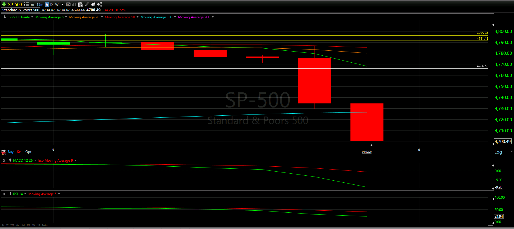
Hourly Analysis
With a solid view of the daily chart, let us look at each of the day’s trading hours between 9:30 a.m. to 4 p.m. ET, or the 7 candles above.
The S&P really took a beating at the end of the day, with 5 of the 7 hours in the red.
It looks like the 3rd hour is really where the momentum shifted. The Moving Averages were in a tight cluster, and once the candle closed under all, that was a telling sign the day was going to be rough. From there, recovery was nowhere in site and the day continued to drop.
Similar to the Dow Jones and NASDAQ, this hourly chart does not look positive at all.
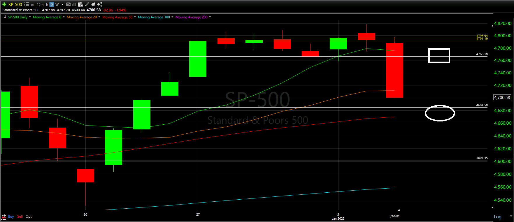
Final Thoughts and Targets
There is a clear correlation between the S&P-500, Dow Jones, and NASDAQ. All are trading below the 8 Moving Average and it seems a downtrend is coming, at least for the short term.
Ideally there is a Support line or Moving Average that will help the S&P bounce back up. However, for now, it seems more likely that we drop to the lower white circle than we rise to the white square.
Good luck trading!